




Instagram Head Adam Mosseri on the ‘Challenging’ Road to Foldable Optimization
Designing a seamless user experience for the ever-evolving landscape of mobile technology is no small feat, and for Instagram, the journey into the world of foldable devices like the iPhone Duo is proving particularly complex. Adam Mosseri, the head of Instagram, has openly acknowledged the significant hurdles his team faces in adapting the popular social media application for the Duo’s unique form factor.
Speaking on Threads, Mosseri shared his insights, stating that the more he delved into the specifics of the iPhone Duo, the more apparent the design challenges became. His candid remarks come as Instagram grapples with user feedback following the global release of its Duo-optimized app on October 23rd.
The Core Conundrum: Vertical Screens vs. Foldable Form Factors
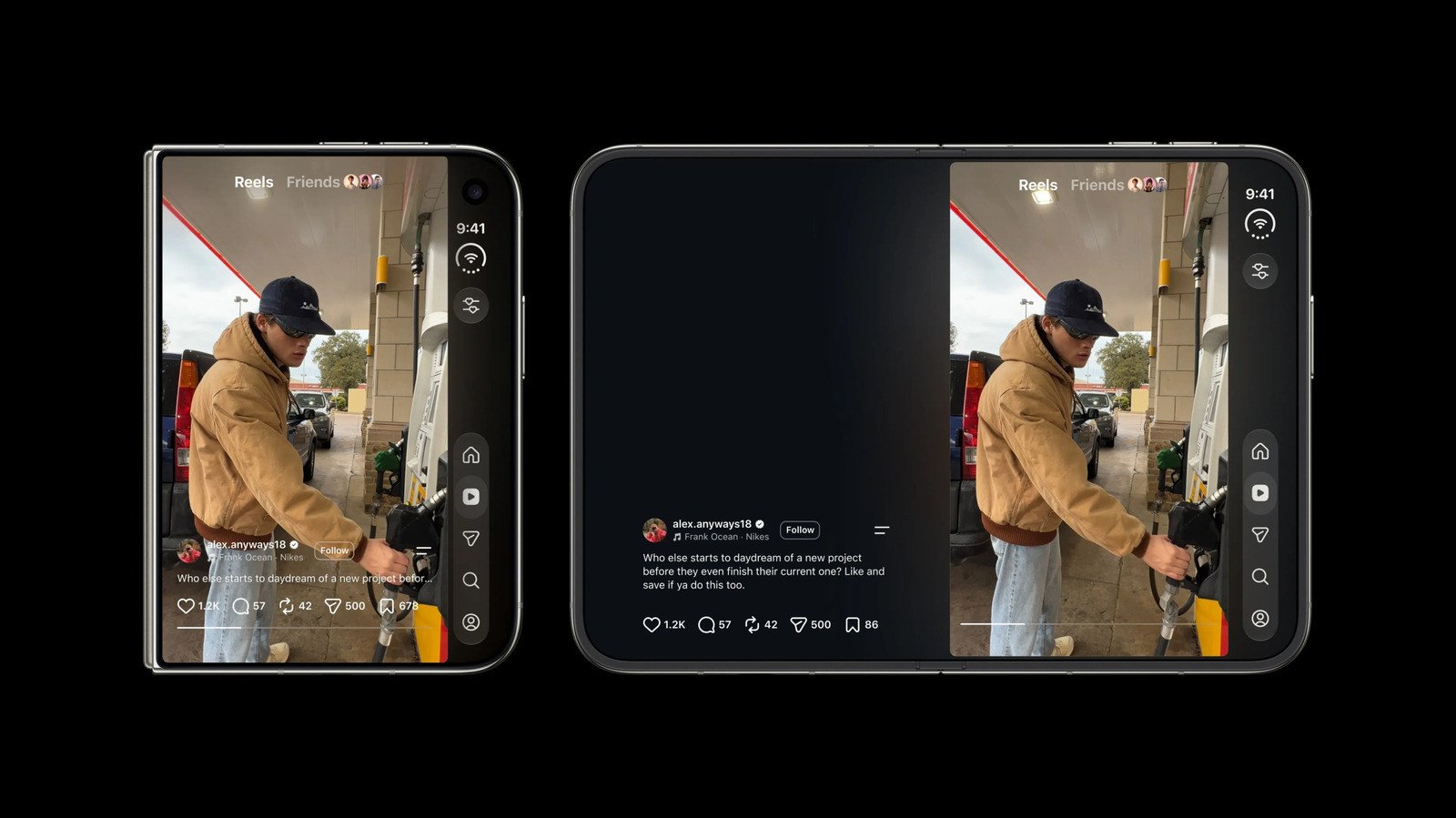
The fundamental issue, as Mosseri explained, lies in Instagram’s foundational design. The app was originally conceived and optimized for “tall vertical screens” – the standard smartphone display. The iPhone Duo, however, presents a stark contrast. Even when folded, its wider and shorter profile deviates significantly from traditional smartphone dimensions, creating an immediate clash with Instagram’s established UI principles.
While one user suggested that the best Instagram experience on the foldable device occurred in portrait mode with the larger screen open, allowing images to dominate the display, Mosseri conceded this was ideal primarily for Reels. He affirmed that Instagram is actively working to enhance the user experience across all orientations, acknowledging the current limitations.
Navigating the “Double Stack of Buttons” Dilemma
A prime example of the design headaches Instagram is confronting is the placement of navigation and interaction buttons. Mosseri highlighted that when the Duo is closed, placing navigation buttons on the right-hand side is ergonomically sound. However, this same area is typically occupied by crucial Reels interaction buttons such as Like, Comment, and Share.
“Now we’ve got this double stack of buttons that doesn’t feel great and that we need to reconsider,” Mosseri lamented, summarizing the kind of intricate UI conflicts his team is tasked with resolving. This “double stack” has, in fact, been a specific point of criticism from users since the app’s launch on the Duo.
Addressing Criticism or Setting Expectations?
Mosseri’s recent comments could be interpreted in a couple of ways. They might serve as a direct response to the “flak” the app has received for its interface, particularly regarding the aforementioned button issue. Alternatively, his statements could be a strategic move to manage user expectations ahead of future updates, signaling that significant improvements are in the pipeline but will require considerable effort.
As foldable technology continues to gain traction, Instagram’s journey with the iPhone Duo underscores the complex design considerations developers face when adapting established platforms for innovative new hardware. The challenge for Mosseri and his team is to evolve Instagram’s interface without compromising the intuitive experience users have come to expect.
For more details, visit our website.
Source: Link



Leave a comment