



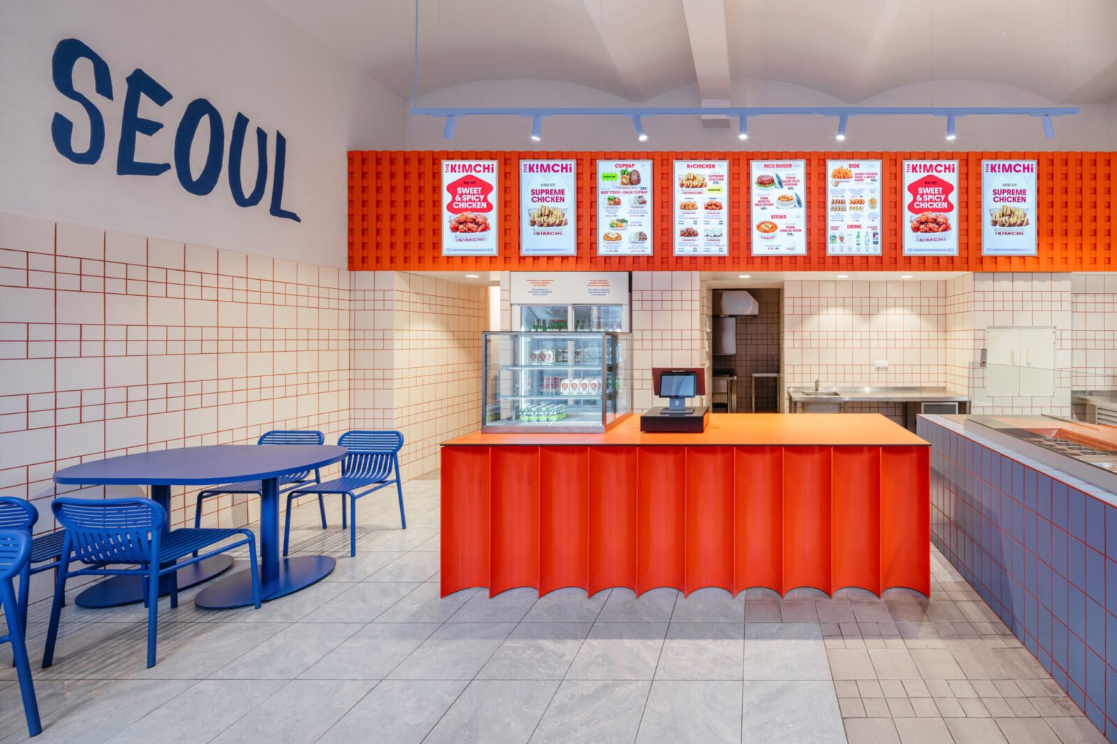

In the bustling heart of Prague, a culinary and design marvel has emerged, redefining how international influences are integrated into local spaces. The Kimchi, a new Korean street food restaurant, stands as a testament to this innovative approach, thanks to the visionary work of SOA architekti. Rather than relying on overt Korean iconography, the architects masterfully distilled the vibrant essence of Seoul, its rich food culture, and the owners’ personal experiences into a cohesive design that blurs the lines between architecture and graphic identity.
A Taste of Seoul, Reimagined in Prague
Nestled beside the historic Masaryk Railway Station, this 1,453-square-foot eatery breathes new life into a former pastry shop. Completed in 2026 by Štefan Šulek and Matěj Střecha of SOA architekti, The Kimchi is the brainchild of a Korean husband-and-wife duo eager to introduce authentic Korean street food to the Czech capital. Their brief to the architects was clear: convey a Korean identity without resorting to a mere collection of clichés.
Eschewing Clichés for Pure Visual Energy
Šulek, co-founder of SOA architekti, articulates the core philosophy: “We wanted the Korean identity to be present without turning the restaurant into a collection of obvious references. What interested us was less the imagery of Korea and more its visual energy—the intensity of color, contrast, graphics, food culture, and contemporary Seoul.” This profound understanding of cultural essence, rather than superficial symbols, became the guiding principle for the entire project.
The Fluid Wave: Architecture Meets Graphic Identity
The most striking element of The Kimchi’s design is an undulating, fluid wave that seamlessly traverses the space. Originating from the exterior signage, it flows across the serving counter and extends along the walls, creating a dynamic visual narrative. Developed in collaboration with graphic designer Tomáš Eisner, this form began as a subtle interpretation of the taegeuk symbol from the South Korean flag, evolving into a more abstract, yet deeply resonant, gesture.
“In such a small space, having one strong gesture that connects architecture and graphic identity was more effective than introducing many different motifs,” Šulek explains. This singular, powerful motif acts as both a structural element and a branding signature, embodying the restaurant’s identity with elegant simplicity.
A Symphony of Color and Texture
Beyond the wave, color plays a pivotal role in defining the restaurant’s atmosphere. A dominant blue hue washes over tables, bench seating, wall finishes, and even subtle lighting details, creating a serene yet vibrant backdrop. This is dramatically contrasted by a grid of ordinary white ceramic tiles, transformed into a graphic surface by bold red grout. Above the counter, a textured orange mesh adds another layer of color and depth, contributing to the overall visual intensity.
Šulek highlights the significance of the red grout: “It is a small intervention using an inexpensive, almost generic material, but it changes how the tiled surfaces are perceived. The grid suddenly becomes graphic and connects with the red elements used elsewhere.” This thoughtful interplay of materials and colors demonstrates how modest details can yield profound aesthetic impact.
Form Meets Function: Designing for a Dynamic Culinary Experience
The compact footprint of The Kimchi necessitated a design where operational efficiency was paramount. While much of the food preparation occurs discreetly away from the main dining area, the final cooking and assembly unfold at the counter, offering guests an engaging, theatrical view of their meals being crafted. Seating, despite the spatial constraints, is remarkably diverse, ranging from intimate window perches and a long communal bench to individual tables and a robust concrete communal table.
These practical considerations ensure that the restaurant’s primary purpose—serving delicious Korean street food—is never overshadowed by its striking visual concept. The Kimchi masterfully draws on the colors, graphics, and energetic spirit of contemporary Seoul, yet its Korean identity is conveyed not through a single, obvious symbol, but through a harmonious blend of architecture, integrated graphics, and the authentic rituals of food preparation and enjoyment. It’s a design narrative where every element tells a story, making The Kimchi a truly unique destination in Prague.
For more details, visit our website.
Source: Link







Leave a comment